
B A B ---> <--- select
Fortify
Fortify is an app created by Impact Suite that provides users with lasting healing from sexual compulsivity. It was designed to equip individuals struggling with compulsive pornography use – young and old – with tools, education and community to assist them in reaching lasting freedom. I was in charge of re-designing the entire app from head to toe which was THE BEST design experience I have had to date. I was given full creative liberty and had so much fun diving into the UX, polishing the UI, and pushing boundaries with experimental illustrations.
The problem
Fortify existed before I joined the team and after doing a thorough design audit, I noticed the experience was overly clinical, had many UX issues, lacked creativity, and had a lot of user retention problems. Most of the Fortify users would join and then stop using the app after a week or so. after doing some digging. It was clear that there were a handful of glaring issues that were causing these retention issues.
Home Screen
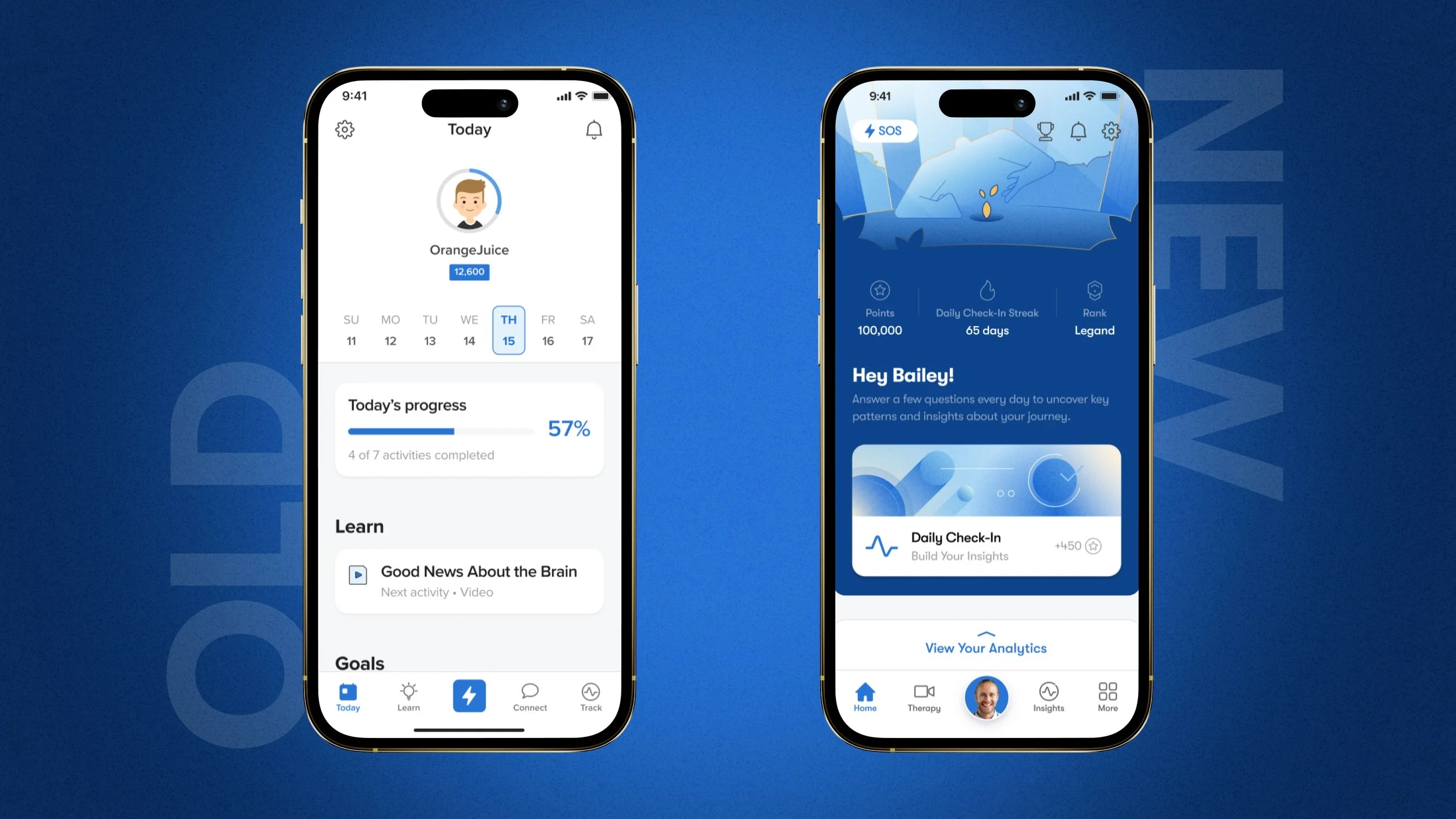
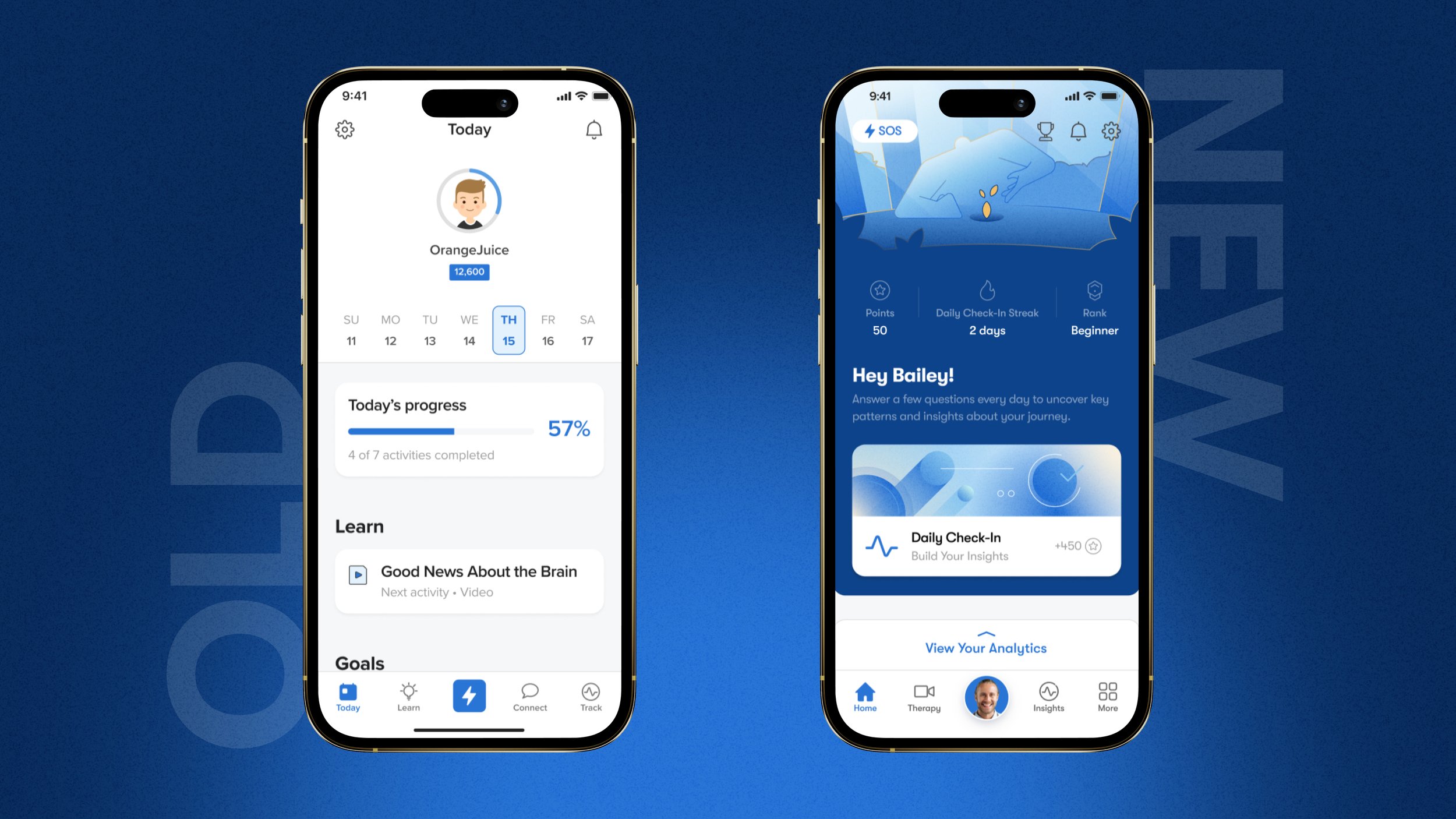
This section of the app was the most fun to design. I wanted the home screen to feel as warm and inviting as possible while also being exciting enough to stoke user engagement. I added a point system, created a progression system, and I enhanced the UI with custom, hand crafted illustrations by yours truly to provide a fun, engaging environment for the users.
Ranking //bADGES//pOINTS
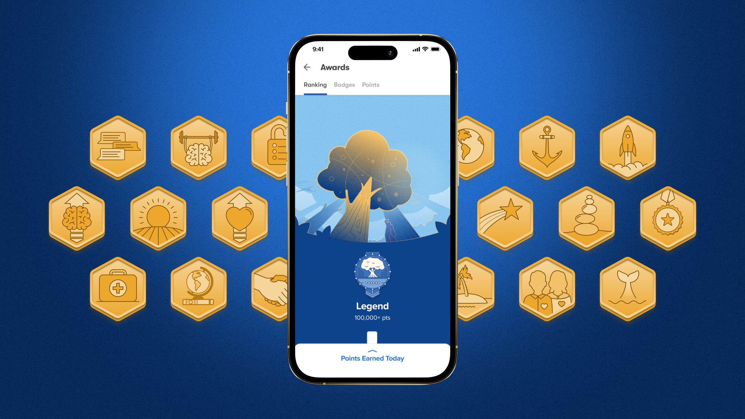
I created a point system and assigned points to specific actions within the app to help with user engagement. Users could then earn points daily, earn badges, and climb the Fortify ranks! Every users starts off planting a growth seed and the more points they accumulate represents how far they’ve grown. After a certain amount of times, users can see their progress grow into a legendary mighty Oak.
Daily Check-In
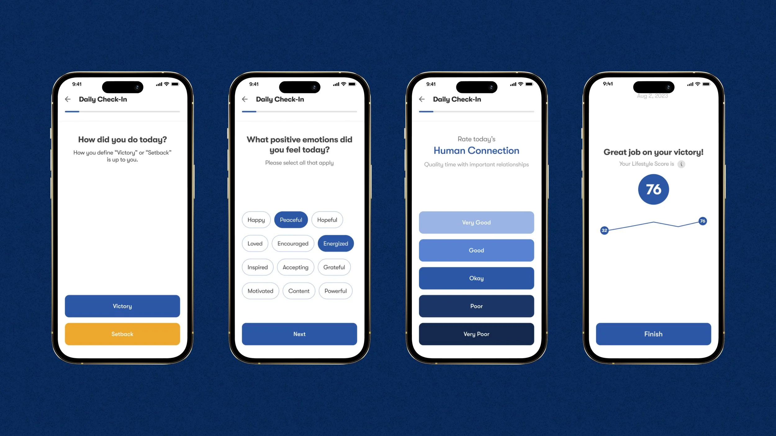
The daily check-in was a feature that already existed before I joined to the team but I wanted to revamp the experience so it felt less cumbersome of a task to perform. The original experience was very clinical, the colors were flat, and it took a while for the user to get through the experience which led users to exit out early and never complete their check-in. This tool in itself is the heart of the Fortify experience because the data collected here allows users to receive personalized insights on their progress with tailored action plans on how to improve. I simplified the flow, added some fun illustrations and animations to make the flow feel like a journey, and we added points to the daily check-in to motivate users to complete the check-in.
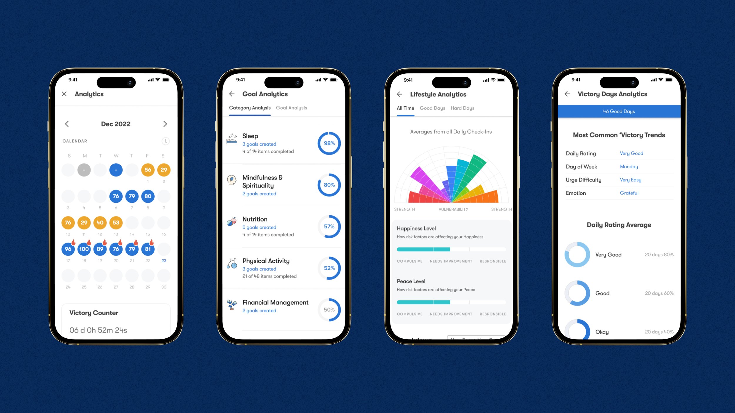
Analytics
Once the user starts filling out their daily check-in, their inputs tracked in the analytics section and this is where the true magic of the Fortify app starts to come into play. The analytics are a way for users to track their behavior patterns…but…there’s some secret sauce in the backend that keeps track of all the users data and when enough data is collected, the Fortify app will start feeding the users custom Insights specifically catered to each user. These insights help users see behavior patterns that are moving the needle towards lasting freedom or keeping them stuck in an addictive cycle.
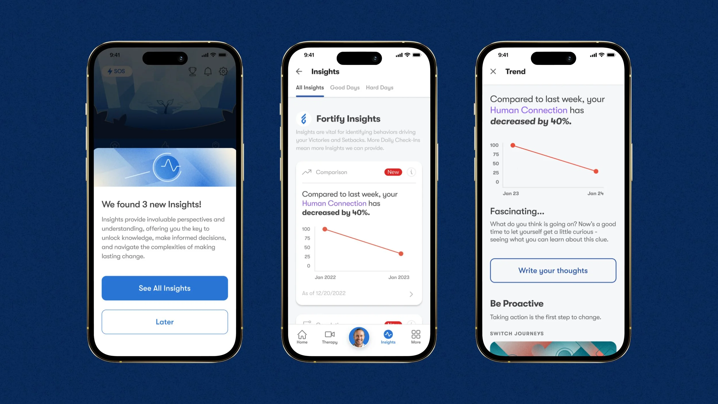
Predictive Insights
Fortify became the first recovery platform that offered predictive insights pertaining to the users healing process. A ton of work was put into this feature as a team and the results were fantastic. This feature alone pushed engagement to a new level. The more daily check-ins the user does, the more precise the insights become. Each Insight uncovers hidden trends, provides encouraging correlations, and reveals personalized predictors pertaining to the users addiction.
Conclusion
The Fortify app has so many other features that I would love to showcase but it’s to much digest in one sitting. The work displayed here are some of my favorite features I designed. I hope you enjoyed what you saw!